Pocket Points App Redesign
Project overview
Pocket Points is a mobile app that helps students get off their phone and stay focused in their everyday lives (especially when they are studying, working, and driving) by offering them rewards. The current app design has succeeded in limiting distractions for the users by using simple layout and minimal colors.
However, in order to motivate the users to use the app to help them stay focused more often, the app needs to be redesigned to be more fun and engaging.
Client: N/A (personal project)
Team: N/A (individual project)
My Responsibilities: Visual & UX Design
Duration: 3 weeks (April 2021)
Tools: Figma & Adobe Photoshop
Redesign goals + visual strategies
Goal 1: Enable the Pocket Point app to help users stay focused when they are studying and working.
Use white text on the dark green background to simulate the look of chalkboard and remind users to focus on what they are doing/should do in the physical world.
Use fonts that are clean, easy to read, and a little bit playful.
Use colors that are neutral, tinted, and not too bright or saturated to keep the users from getting distracted while using this app.
Goal 2: Motivate users to use this app more often.
In crease the game feel of the app - make it challenging yet fun.
Use interesting and interactive graphs / infographics to help users visualize their progress.
Use bold text, colors, and eye-catching images to make reward-related information and activities more stand out, i.e., remind users of the benefits of using this app.
Goal 3: Make the experience of gaining points and viewing rewards more fun.
• Use round shapes and fonts to make the user interface look more playful.
• Add some personalization features and using icons that express joy to make the app more engaging.
Style guide + mood board
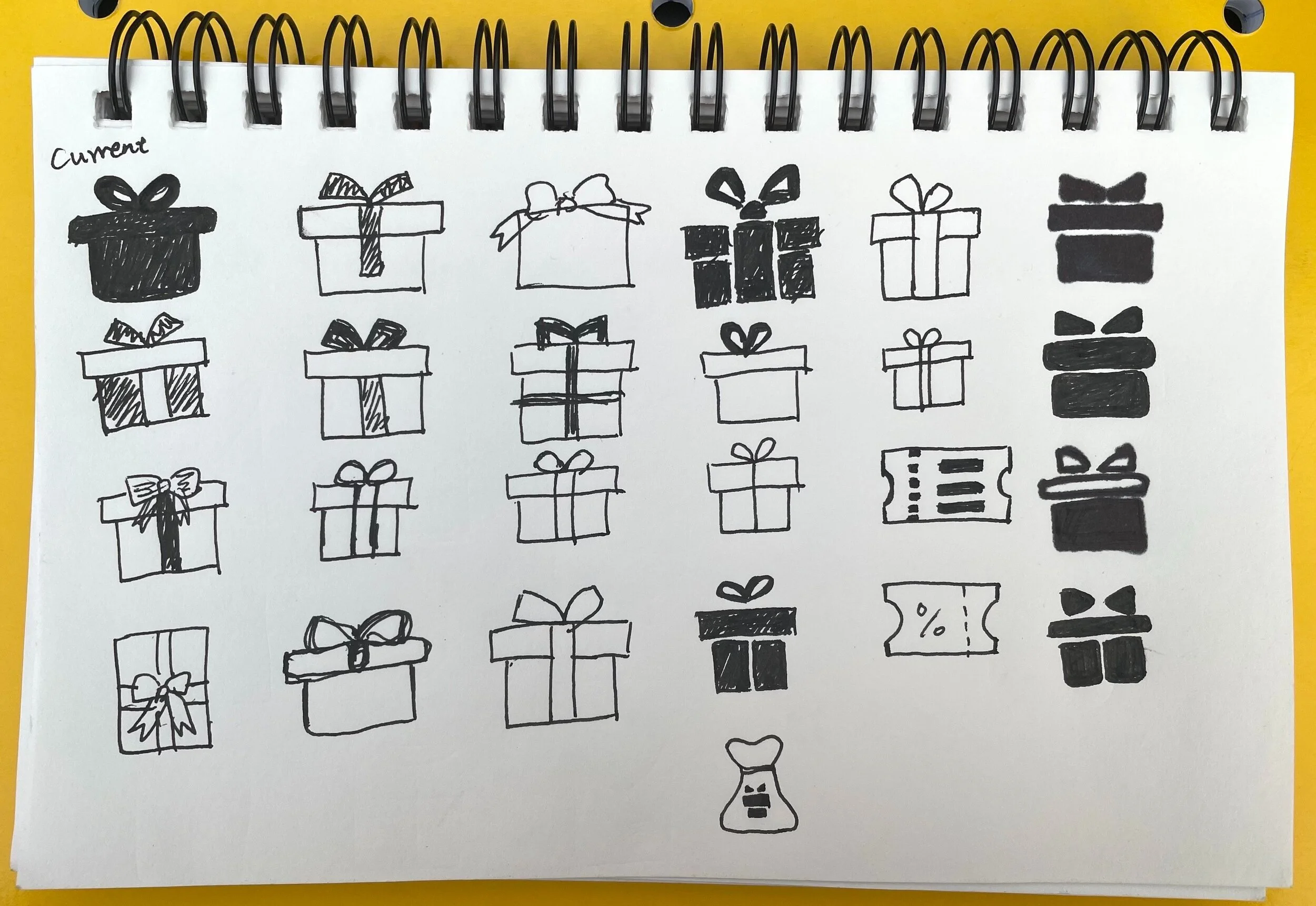
Sketches
Design iterations
I experimented with different colors, shapes, and layout and iterated on my design based on the feedback I received from other design students and the instructor during weekly design critique.

